There is a specific moment most teams remember: the day they stopped checking the dashboard. Not a dramatic decision. No announcement. The tab just quietly stayed closed a little longer each week until one day it wasn’t opened at all. The tool still worked. The data was still there. The subscription kept renewing.
When this happens, the instinct is to blame the data — stale sources, integration issues, numbers that never quite matched what the team expected. But the data is rarely the problem. Most modern business tools are actually quite good at pulling and presenting accurate information.
The problem is what surrounds it.
The Real Reason Dashboards Get Abandoned
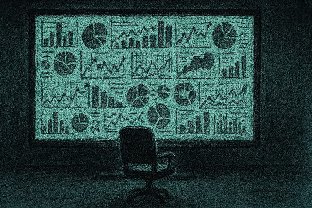
A dashboard is an instrument panel. It shows you everything simultaneously — revenue trends, lead volumes, conversion rates, activity metrics, pipeline health — and asks you to do the cognitive work of deciding what to pay attention to.
That is a significant ask. Particularly for a team that is also responsible for doing the actual work those metrics describe.
The irony of most business intelligence tools is that they were designed to reduce cognitive load, but in practice they increase it. Every additional metric on a dashboard is a decision the user has to make on every visit: does this number require action? Is this trend significant or seasonal? Has anything here changed enough to matter?
Multiply that across twelve panels and thirty data points, and the dashboard stops being a tool that surfaces insight and becomes a chore that defers it. People stop going. Not because the data is wrong, but because the noise around the data is exhausting.
A dashboard that shows everything is a dashboard that communicates nothing. The signal is buried. The noise wins.
What Noise Actually Costs
Noise in a business context is not just an inconvenience. It has a specific and measurable cost: the decisions that do not get made because the information that would prompt them could not be found quickly enough, or at all.
A sales lead that went quiet three months ago resurfaces as a newly funded company actively hiring in your target function. That is a signal. If it is sitting inside a CRM alongside four hundred other contacts, each with their own last-activity date, their own status field, their own notes from calls that may or may not have been logged — finding it requires either a manual review of the entire database or the discipline to run specific searches on a regular basis. Most teams do neither. The window closes.
The same pattern plays out across every function. A client whose usage data has quietly declined for six weeks. A competitor who has changed their pricing page. A contact at a target account who has just moved into a decision-making role. Each of these is a moment that, acted on correctly, produces a materially better outcome. Buried in noise, each of them expires.
The Design Flaw Nobody Wants to Admit
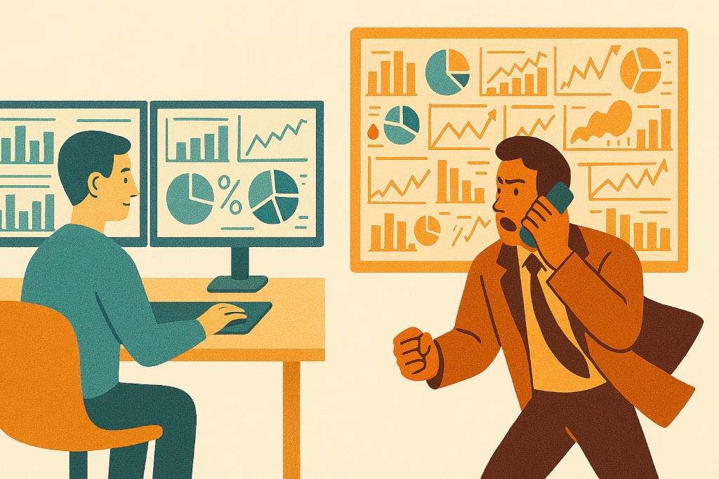
The dashboard model has a structural problem that its proponents rarely acknowledge: it was designed for analysts, not operators.
An analyst’s job is to interrogate data — to form hypotheses, explore relationships, and surface patterns that are not immediately visible. A dashboard built for that purpose should show everything, because the analyst does not yet know what they are looking for. The breadth is the point.
But most of the people using business dashboards today are not analysts. They are founders, practice directors, account managers, operations leads — people with a full workload who need to extract a small number of actionable conclusions from a large volume of information as quickly as possible. For them, the breadth is not the point. It is the obstacle.
Giving an operator an analyst’s tool and expecting it to drive action is like handing someone a map of the entire city when what they asked for was directions to the nearest meeting. Technically everything they need is in there. Practically, it does not help.
The Difference Between a Dashboard and a Signal
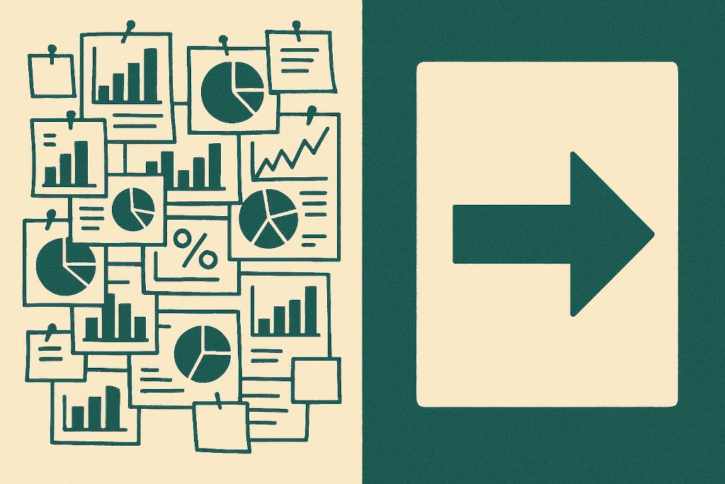
A dashboard presents. A signal concludes.
The distinction sounds simple, but the operational difference is significant. When a dashboard presents data, the work of interpretation remains with the user. When a signal concludes, the product has already done that work — it has monitored the data continuously, compared it against a threshold or a pattern, and determined that something has changed enough to be worth surfacing.
A dashboard says: here is your pipeline, sorted by stage, last updated yesterday.
A signal says: this deal has had no activity in eighteen days and closes in two weeks.
A dashboard says: here are all the companies in your target segment, with their last known funding date and employee count.
A signal says: three companies in your target segment raised a funding round this week. Two of them match your ideal customer profile.
The data behind both statements is identical. What differs is who did the interpretive work. In the dashboard model, that is the user. In the signal model, that is the product.
How to Know If Your Dashboard Has a Noise Problem
The signs are consistent enough to function as a diagnostic. A dashboard has a noise problem when the team checks it less frequently over time without a deliberate decision to do so. When the most common use of the tool is pulling specific numbers for a report, not discovering something new. When the insight that drives the most important decisions in any given month came from somewhere other than the dashboard — a conversation, a chance observation, a spreadsheet someone built themselves.
None of these are signs of a bad team or a poorly configured tool. They are the natural response to a system that asks more of its users than it gives back. When the cost of using a tool — in time, in cognitive effort, in the frustration of finding nothing actionable — consistently exceeds the value it returns, people stop using it. That is rational behaviour, not a failure of discipline.
The solution is not to train the team to use the dashboard more consistently. It is to replace the dashboard model with one that meets the team where they are: delivering pre-interpreted conclusions, at the right moment, without requiring anyone to go looking.
What the Alternative Looks Like in Practice
Signal-driven software is not a new category of tool. It is a different design philosophy applied to the same underlying data. The data sources, the integrations, the underlying monitoring — all of this can remain identical. What changes is the output layer: instead of presenting everything and asking the user to find what matters, the product identifies what matters and presents only that.
For a business development team, this looks like a weekly brief: the three companies in your target market that showed buying signals this week, why each one is worth reaching out to, and who in your network has a connection. Not a screen full of logos and timestamps. A short list with a reason attached to each item.
For a practice managing multiple client relationships, this looks like an alert: one of your clients added a new subsidiary last month. Here is what that means for their current consolidation structure and whether their existing engagement covers the new entity.
The information density is lower. The actionability is higher. The time required to go from opening the tool to knowing what to do next drops from forty minutes to four.
Why This Matters More Now Than It Did Five Years Ago
The volume of data available to businesses has grown faster than the capacity of teams to process it. Five years ago, a small firm might have had a CRM with a few hundred contacts, a basic accounting system, and a spreadsheet tracking pipeline. Today, the same firm has integrations across five platforms, access to market intelligence tools, social listening feeds, and automated enrichment data flowing in continuously.
More data with the same headcount means more noise per person. The dashboard that was manageable in 2019 is overwhelming in 2025. The teams that are winning are not the ones with the most data. They are the ones with the best filter.
What BrizoMarket Was Designed Around
BrizoMarket is BrizoSystem’s market signal platform for professional services firms and lean business development teams in Singapore and the region. It was not designed to be another dashboard. It was designed to replace the need to check one.
The firms we built it for already have more data than they can act on. What they do not have is a product that has already decided which part of that data matters this week — and why, and to whom.
That is the problem BrizoMarket was built to solve. Not by adding to the noise. By cutting through it.