
This month, the BrizoSystem team rolled out several enhancements designed to make your financial reporting experience smoother, clearer, and more collaborative. Here’s a quick look at what’s new.
✨ Refreshed User Interface for a Cleaner Experience
We’ve given BrizoSystem a visual refresh to make navigation more intuitive and the overall experience more modern. The improved layout helps you find what you need faster—whether you’re reviewing consolidation results or building reports.
🎨 Improved Chart Colors for Clearer Insights
Charts across the platform now benefit from updated color palettes. The new colors provide better contrast and readability, making trends easier to interpret at a glance.
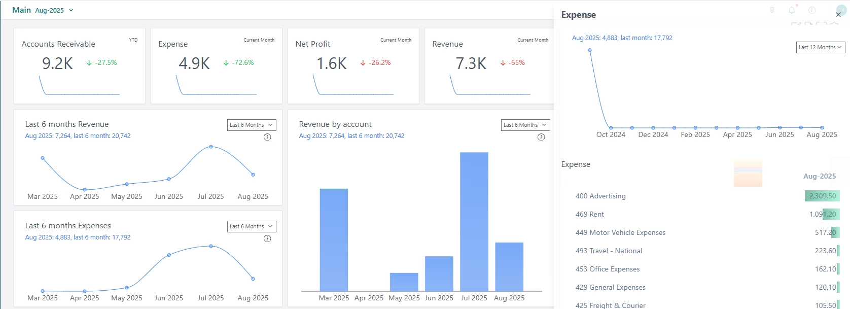
📊 New Slide Dialog on Dashboards
To help you dive deeper into your numbers without losing context, dashboards now include a slide-in dialog.
You can click any data point in the current reporting month to instantly view a detailed breakdown of the underlying accounts—right from the dashboard.
📄 Polished Report Layouts for Better Clarity
Financial reports now feel more structured and professional:
- Proper indentation has been added to improve readability.
- Zero values are now displayed using a clean dash (“–”) for a more consistent look.
- Clicking any account row header opens a slide dialog with additional information and insights, helping you understand the numbers behind each line.
🤝 Introducing the BrizoSystem Share & Earn Program
We’re excited to announce the launch of our Share & Earn Program, powered by Reditus!
Users can now refer new customers and earn 20% recurring commissions on successful paid subscriptions.
It’s a simple way to share the value of BrizoSystem—and get rewarded for helping others streamline their financial consolidation.